The square looks great. The Story looks like the square floating in a tall box. And somewhere between the two, the date became too small to read.
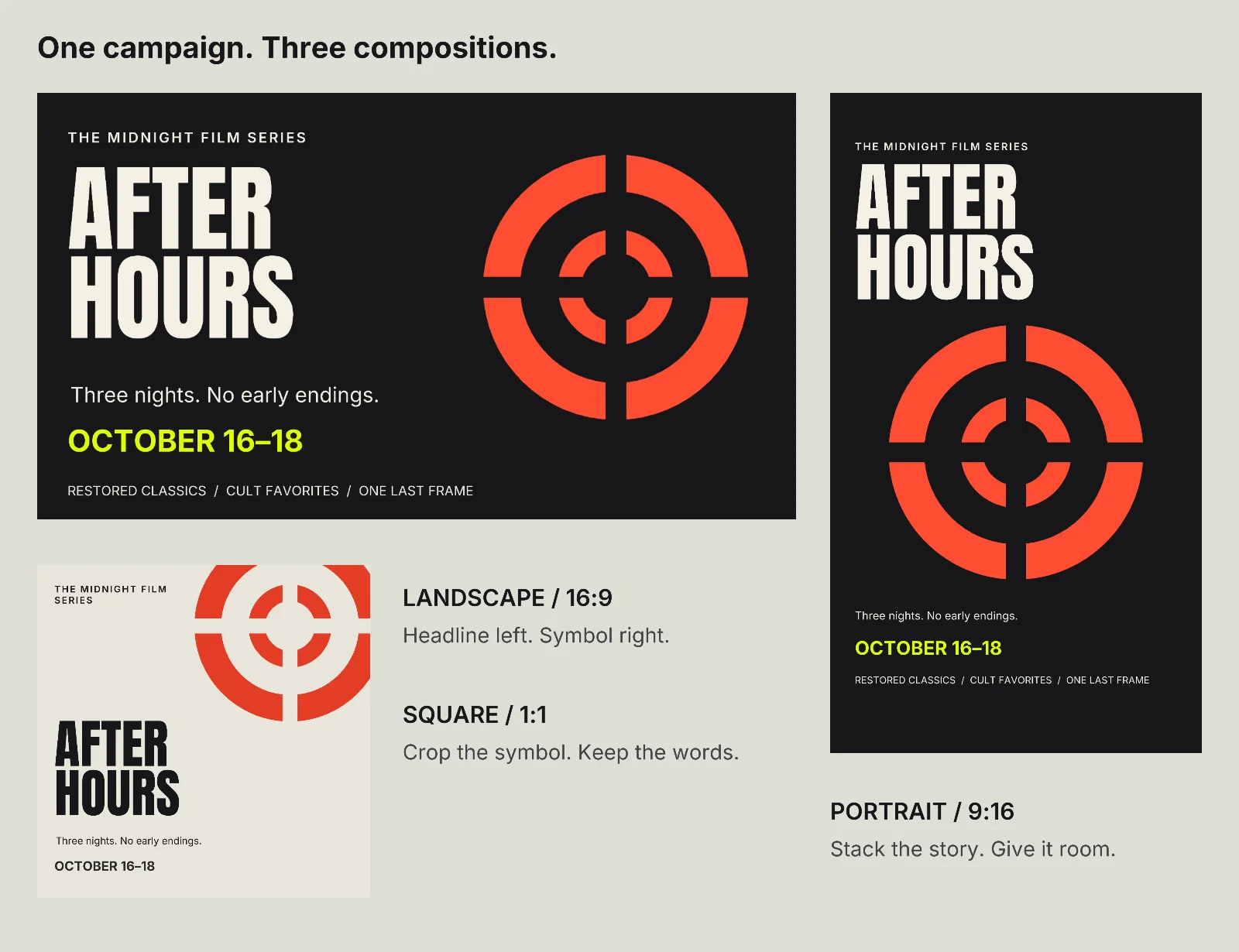
Resizing social media graphics is a layout problem. Keep the campaign's identity, then give each shape its own reading order. Below is a fictional midnight-cinema campaign in three formats, with editable artwork and a prompt you can reuse in your own design tool.
Download the editable campaign and individual PNGs.
Specify the layout before changing the aspect ratio
AI tools increasingly help maintain an image's visual style. Recraft's V4 Styles guide, for example, separates style references from the prompt's composition instructions. That distinction matters when a single campaign needs several placements: matching colors does not make the date readable in every shape.
Use this brief with a design agent, or treat it as a checklist in a layered editor. The sample artwork here was built from vector shapes and live type, without image generation.
Adapt this campaign into three editable layouts:
1600×900 landscape, 1080×1080 square and 1080×1920 portrait.

Keep the title, date, fonts, palette and central symbol consistent.
Compose each frame separately. Do not scale the whole finished design.

Landscape: put the headline beside the artwork.
Square: crop the artwork deliberately and give the headline its own space.
Portrait: stack headline, artwork and event details. Reserve space at
both ends for the destination's interface.

Keep the headline and date readable at 400 pixels wide.
Reposition or crop decorative art before reducing important text.
Export each format separately and show all three together for review.
These are sample canvas sizes, not a universal platform specification. Check the placement's current dimensions and interface overlays before delivery.
Give each format a different job
Our After Hours example uses Anton for the headline and Inter for supporting copy. The red aperture symbol supplies recognition without needing the same position everywhere.
| Format | Layout decision | What stays prominent |
|---|---|---|
| Landscape | Put title and symbol side by side | Title first, bright date below |
| Square | Crop the symbol into the upper corner; use a light background | Full headline and date, with less supporting copy |
| Portrait | Stack the headline above a larger symbol | Title, image, then event details |
The square drops the longer film-category footer. That is a useful trade: optional detail can move to the post's caption. Making every word smaller would weaken the whole graphic.
Review individual exports at phone width, not just the attractive overview board. Read the date without zooming, check the longest line, and look for artwork touching letters accidentally. A deliberate art crop is fine; cropped information is a different problem.
Update all three dates in Voyager
Once the layouts work, the next problem is keeping them synchronized. In Voyager Design, we put all three frames in one editable document. The symbol is a reusable component, colors come from Night and Paper modes, and every date reads the same named variable.
Then we made this revision:
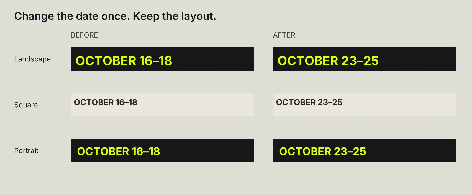
Change the shared Cinema date variable from OCTOBER 16–18 to
OCTOBER 23–25 in both Night and Paper modes. Keep all three layouts,
type sizes and artwork unchanged. Save a revised editable document
and export the Landscape, Square and Portrait PNGs.
Description / transcript
The completed date revision is visible in the conversation. The landscape, square and portrait exports open in turn, followed by the campaign overview. Each displays October 23–25.
The exported files changed only around their dates. This is the useful Voyager extension: an agent can edit the shared value and export the whole set from the same project. Linked components and variables also exist in other design tools; the benefit here is carrying the revision through to the deliverables in one request.
The download includes the original and revised .vdesign documents, PNGs and SVGs with live text. SVGs remain editable elsewhere, but do not preserve Voyager's shared variable connections. Install Anton and Inter before editing them.
Approve the smallest view, then revise the system
Before calling a campaign finished, do two things: read each export at its intended size, and make one realistic copy change across the set. The first catches weak layouts. The second catches files that only look coordinated.
For motion after the layouts are settled, see how to animate a poster with editable layers. Start with graphics you can revise confidently; every future format then has a stronger starting point.
Make your next project in Voyager
Create an account, download Voyager, and start making.